FannDrop Wallet
Industry
Music
Company
FannDrop
Service
Product
Date
Nov 2025—Oct 2026
FannDrop helps artists share their earliest work and lets fans support them from the start. The wallet is where all the money moves happen.

The opportunity
Instagram is for polished content. Streaming platforms are for finished music. This leaves a huge gap in the rough, uncut process between the first inspo and the final edit - the part that actually connects fans with their favourite artists. FannDrop is for everything in between.
As one half of a two-person design team, I worked on a couple of key features, including the FannDrop Wallet. I designed how artists manage their earnings and how fans show real, cash-backed support to the artists that match their vibe.
My role
I drove the design across product architecture, interface, and experience.
Spearheaded a week-long design sprint to architect the end-to-end FannDrop Wallet experience from the ground up
Collaborated with product, engineering, and compliance to design a seamless multi-currency ecosystem powering transactions, rewards, and fan engagement across FannDrop's music economy
Led iterative prototype testing during development, revealing friction points and shaping product direction
Delivered user-centred design solutions while advancing business objectives for retention and monetisation

Making two balances feel like one
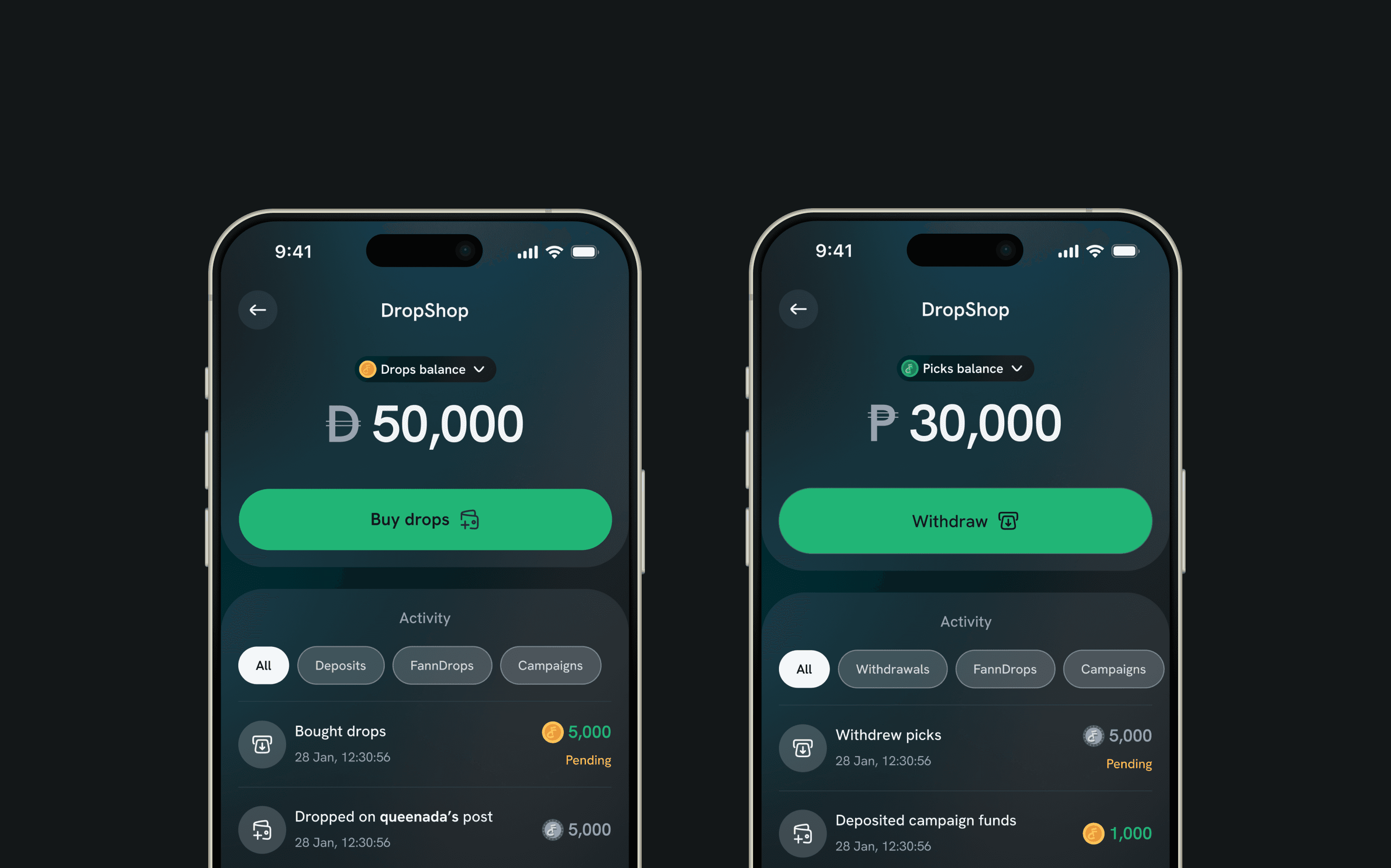
The FannDrop economy relied on two interconnected balances: Picks, which represented creator earnings, and Drops, which represented spending power within the platform. While this separation was necessary to support the underlying business model, surfacing both balances risked making users feel like they were managing two different wallets.
The challenge was to preserve the distinction between the balances without increasing cognitive load. Early explorations that displayed both balances simultaneously felt overly technical and forced users to think about the platform's architecture rather than their goals.
To simplify the experience, I introduced a lightweight balance switcher. Instead of using a full-screen modal or tabs that interrupted the user's flow or showed multiple balances, I designed a compact dropdown anchored directly to the balance component. This allowed users to seamlessly switch between Picks and Drops while remaining in context, making the interaction feel more like changing views within a single wallet than navigating between separate accounts.

Consolidated notification system
Beyond balance management, I recognised that fragmentation could also emerge through wallet activity and updates. As transactions, earnings, rewards, and spending events accumulated across both balances, separate notification streams would have reinforced the perception of two distinct systems. To address this, I designed a consolidated notification centre that unified activity from across the wallet experience.
To keep the interface powerful without overwhelming users, I paired the notification system with a set of simple yet visually refined filters. Users could quickly narrow activity by category while still viewing everything from a single destination. The filters provided clarity and control without adding complexity, allowing the notification experience to scale alongside the wallet.
Together, the dropdown switcher and consolidated notification system created a cohesive financial experience. Rather than exposing the underlying mechanics of Picks and Drops, the design focused on helping users understand one connected ecosystem, where earning, spending, and tracking activity felt intuitive and effortless.
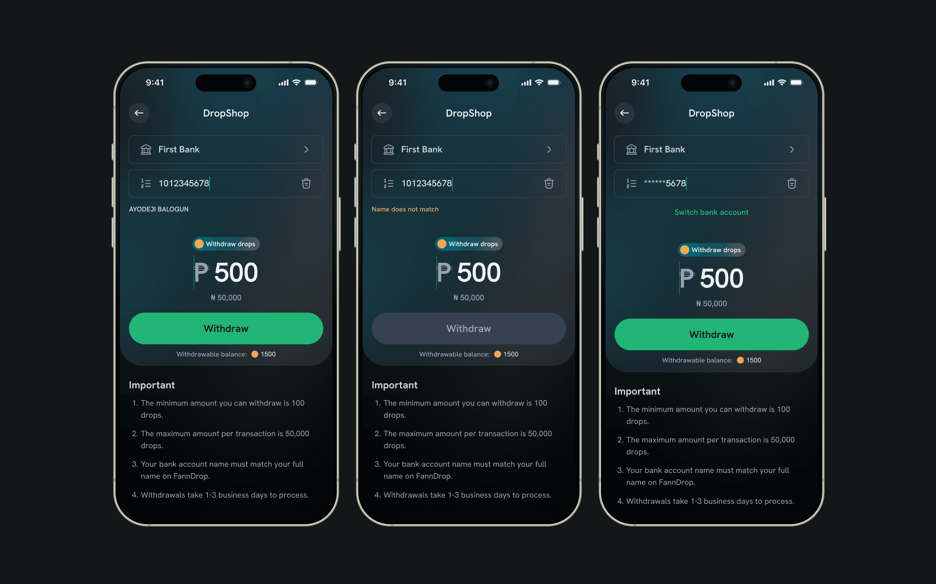
Key design decisions
Introduced a contextual dropdown switch instead of a disruptive full-screen modal.
Maintained continuity by keeping users within the same wallet surface when changing balances.
Unified wallet activity through a consolidated notification centre.
Designed elegant filtering mechanisms that improved discoverability without cluttering the interface.
Prioritised a single mental model for the wallet despite the existence of multiple underlying balances.
Outcome
The final experience allowed users to interact with Picks and Drops without feeling like they were managing separate financial products. Balance switching became lightweight and intuitive, while the unified notification system provided a clear overview of wallet activity. Together, these decisions reduced cognitive load, increased transparency, and helped the FannDrop economy feel cohesive, scalable, and easy to understand.
By combining a contextual balance switcher with a unified, filter-driven notification system, I transformed a potentially complex two-balance economy into a wallet experience that felt singular, elegant, and effortless to navigate.


